Brand ID & Creative Direction
Identity, Retail Development, Digital, Print, DesignThrough rebranding Blackwing, I not only played a key role in updating a heritage brand but also introduced new thinking to packaging, accessories, and product along with sustainability initiatives.
All of that history was accounted for in the new branding of Blackwing. With a refreshed look both modern & timeless while staying true to the pencil that made them an influential piece of history, Blackwing is growing beyond just the pencil.
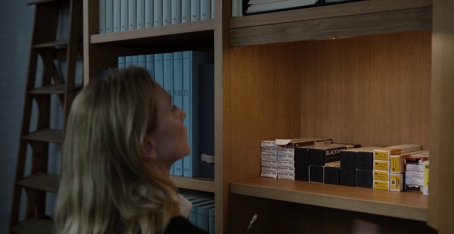
Blackwing Pencils – Tar
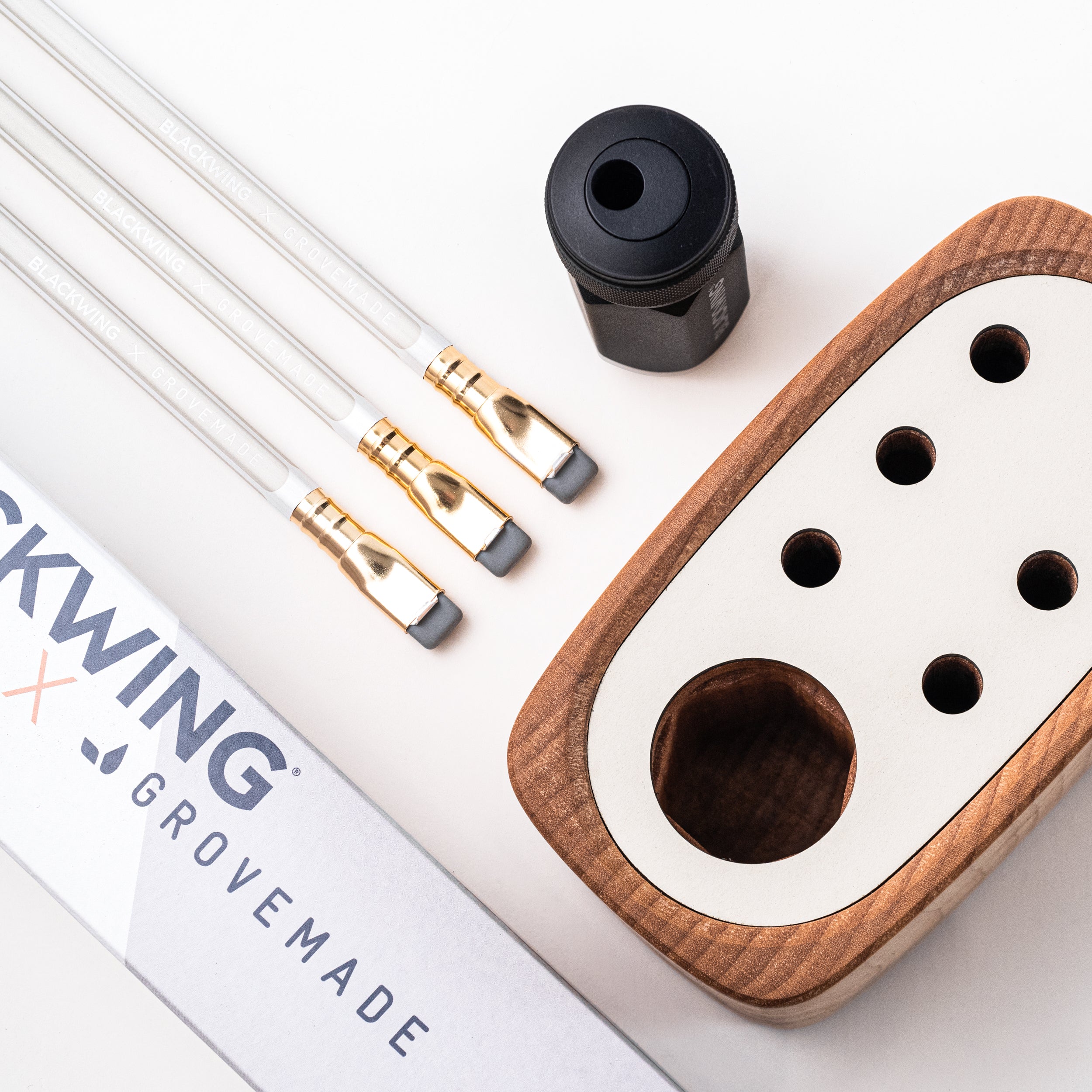
The introduction of a new language to expand beyond the pencil
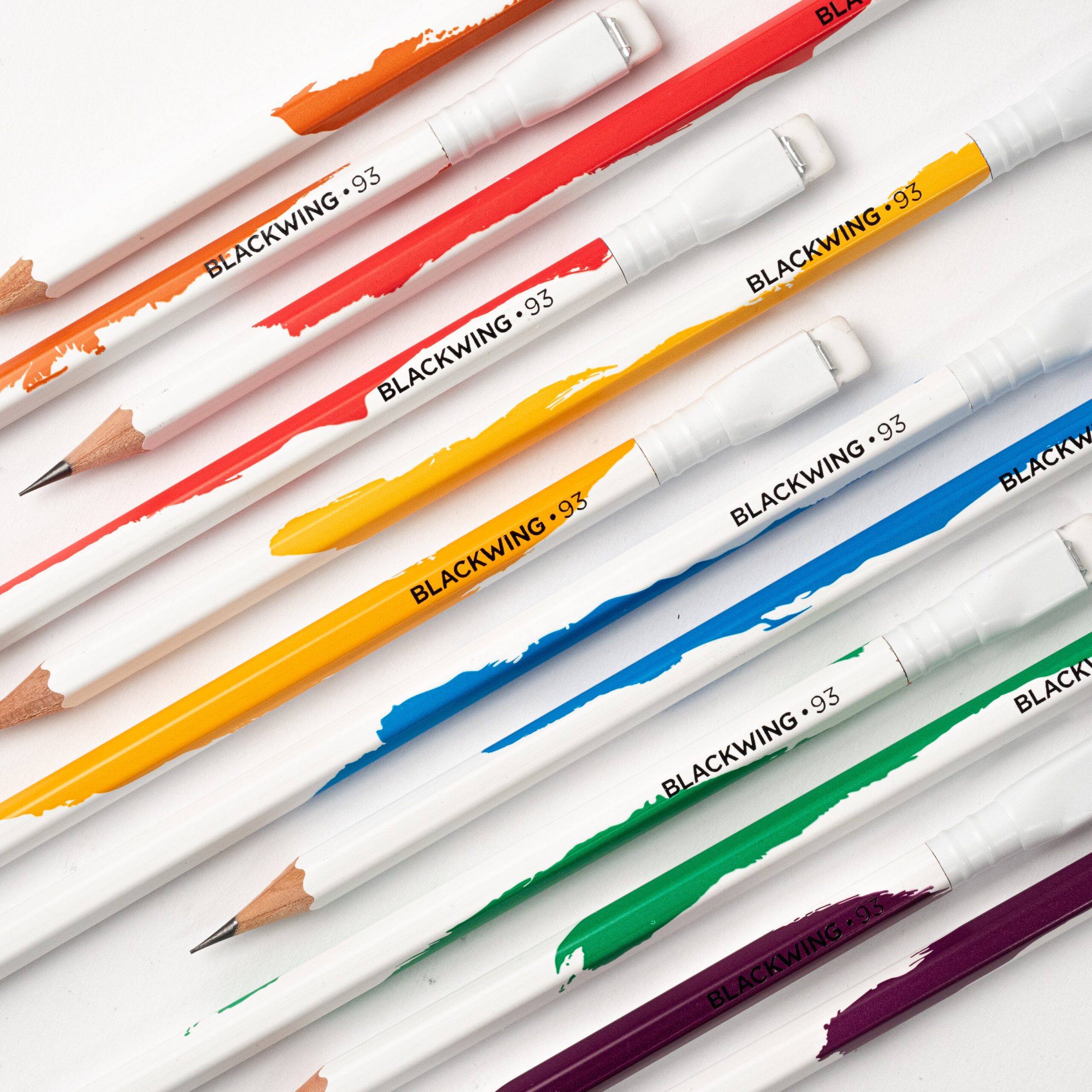


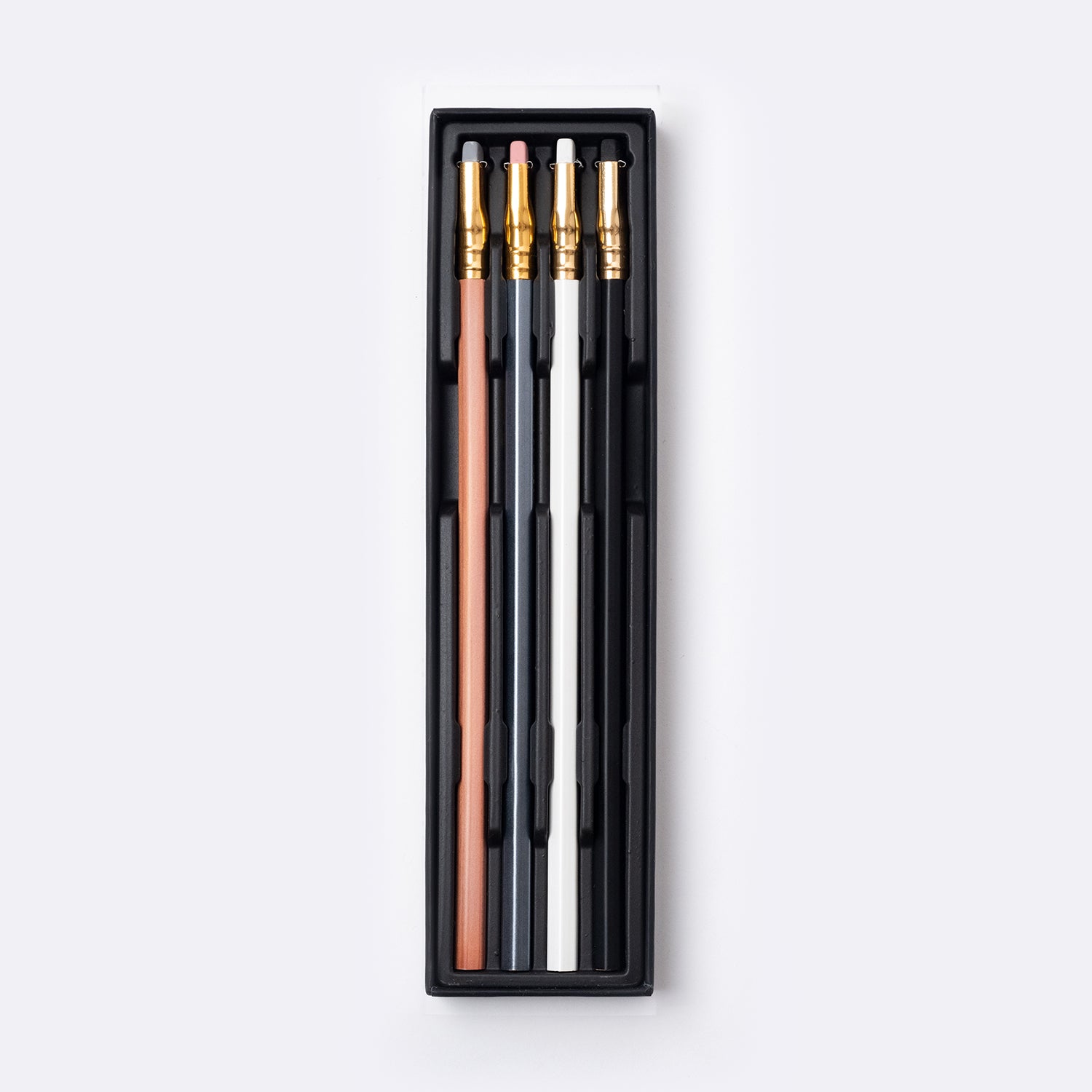
Blacwing • 93 – Series from the limited edition product line
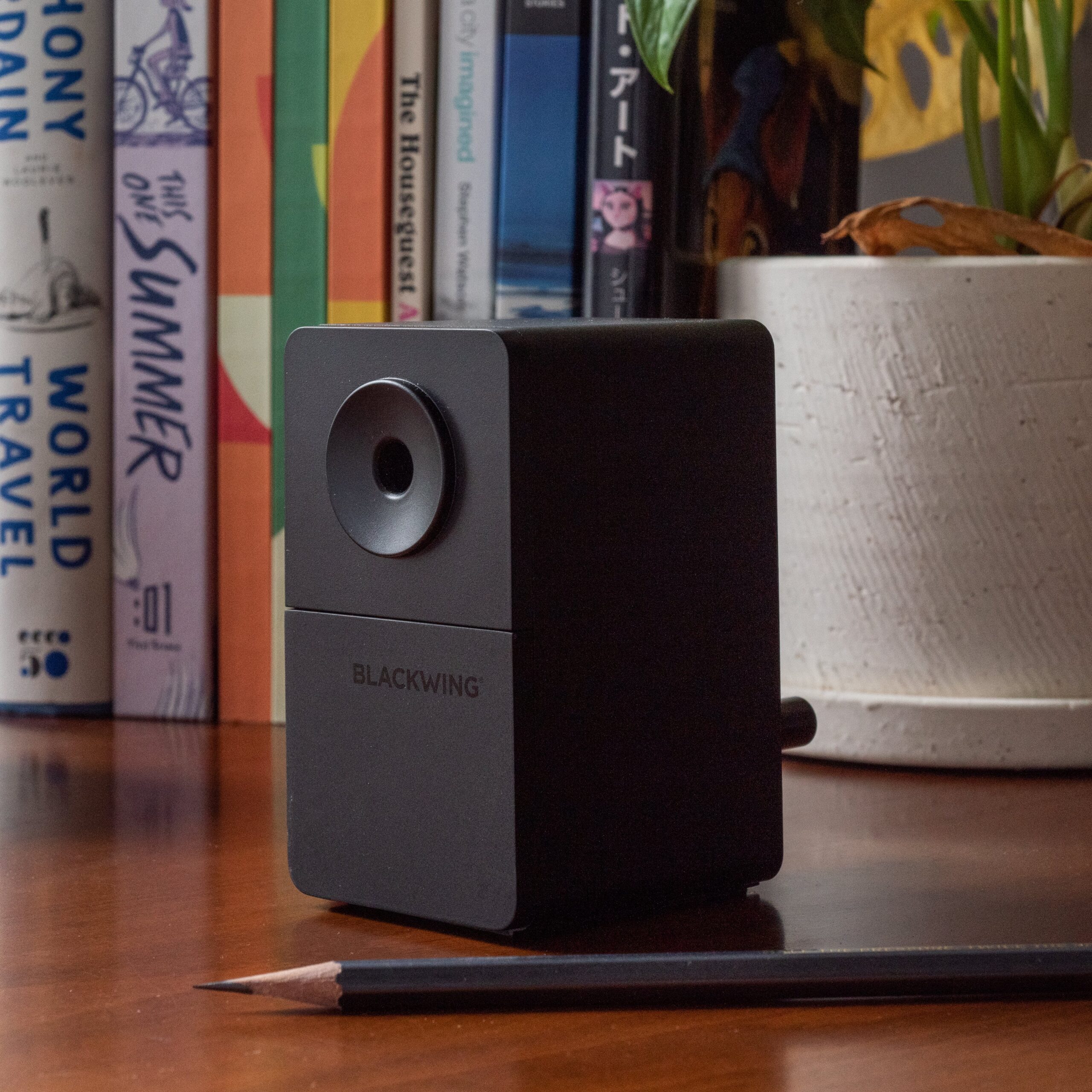
Redefining product design for a complete package
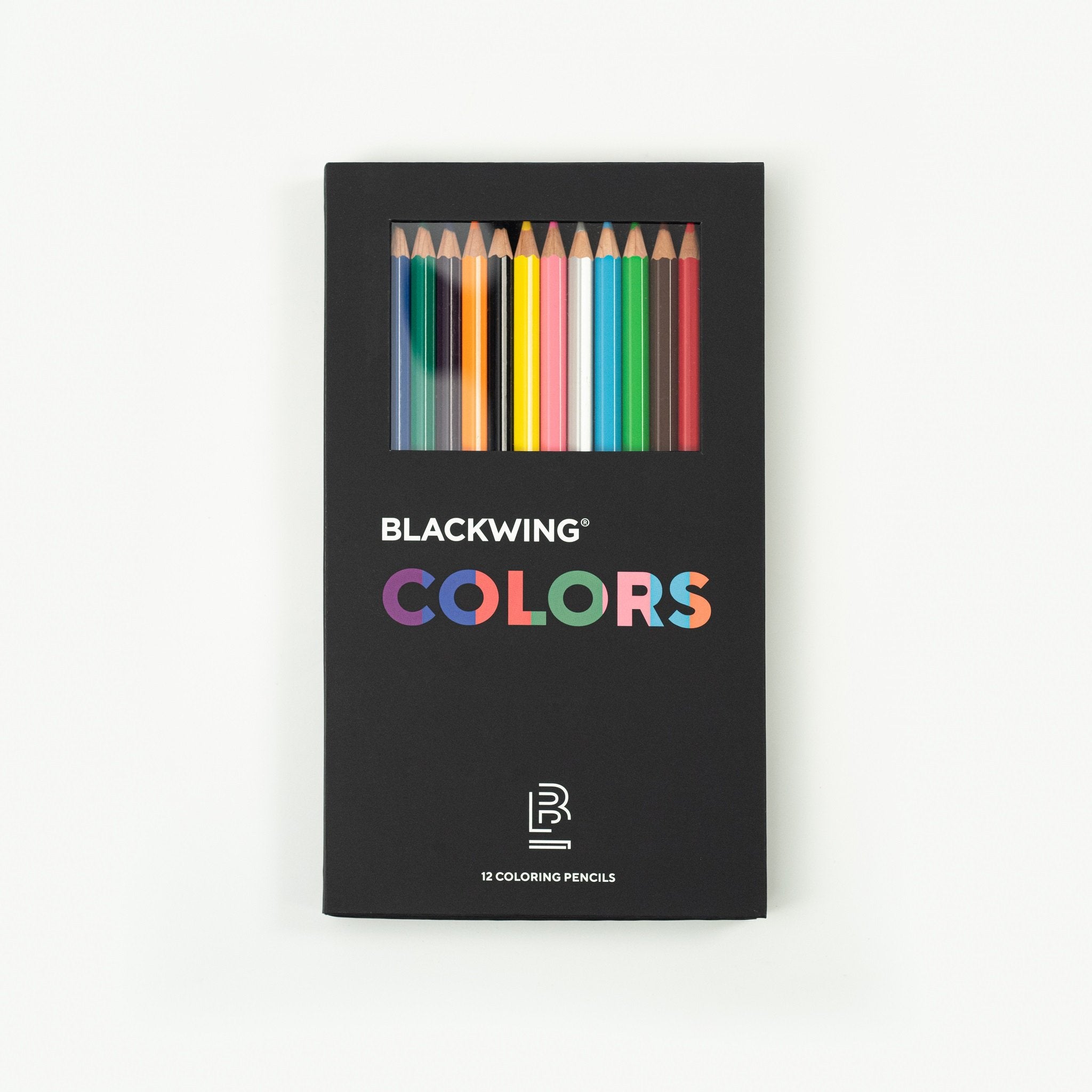
Blackwing pencils – Packaging design and product